Retrace the paths of the Atlantic Coast’s most powerful hurricanes and learn which regions have historically faced the greatest exposure from major storms with a series of new maps on the Portal.
The maps are based on over a century’s worth of data provided by the National Oceanic and Atmospheric Administration. They include:
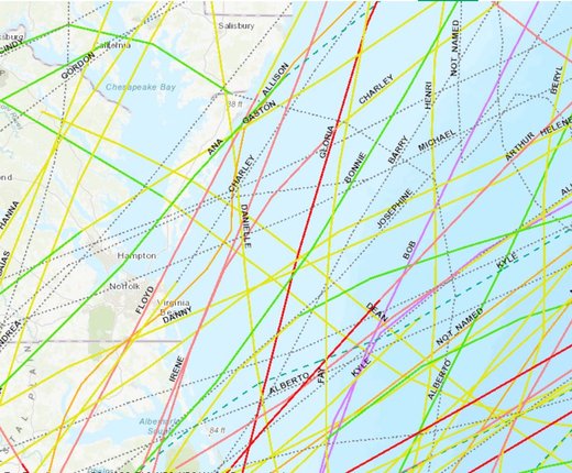
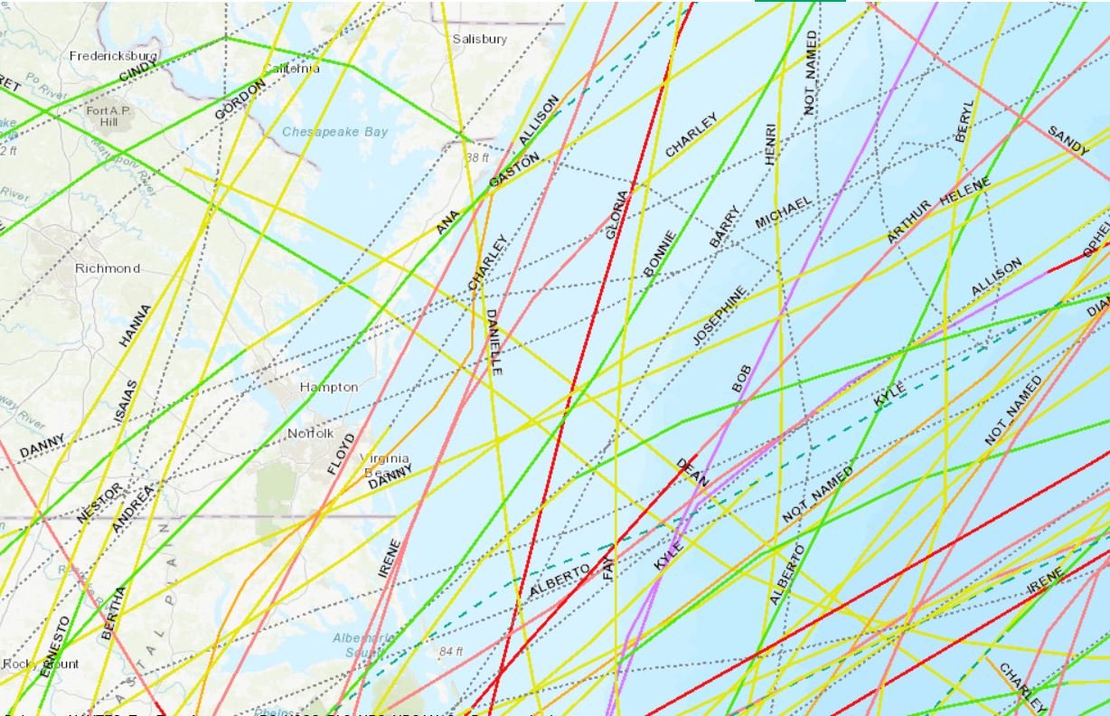
- Hurricane Tracks Since 1980 in the North Atlantic Slider: Animate or toggle through four maps showing the paths of storms in the 1980s, 1990s, 2000s and 2010s. Track lines are labeled with each storm’s name and are color-coded to indicate the points where a storm intensified or was downgraded -- for instance, from a category 1 hurricane to a tropical storm.
- Hurricane Tracks Since 1980 in the North Atlantic: Shows the combined paths for all named storms between 1980 and 2019. Users can click on any point along the track line for a pop-up window containing information about the storm when it arrived at that location, including the date/time, its maximum wind speed and distance from shore.
- Tropical Cyclone Wind Exposure (North Atlantic, 1900-2016): Areas in this map are color-coded to depict how many tropical storm-force or stronger wind events they encountered over the course of 116 years. Users can click on the map for a pop-up containing a breakdown of how many storms by severity (e.g., 34-, 50- and 64-knot wind occurrences) passed through that area and the average number of years that passed between those types of storms. The map was first published on MarineCadastre.gov.
To access these maps, click on the Oceanography theme in Marine Planner and then click on Storms for a dropdown menu. For help using the Slider & Animation tool, click here.